Portfolio · websites
Websites that make people book and get in touch
We build websites and landing pages end to end: structure, copy, design, mobile version and launch. Below are pages that are already live. Scroll each one here or open it live.
Scroll the page inside the frame
j-SPLiT, a DJ and musician from California
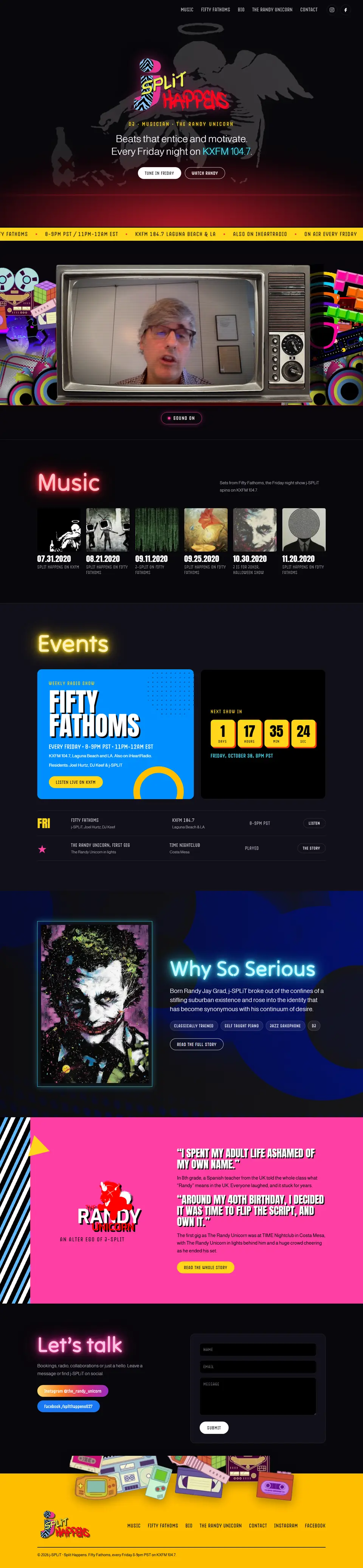
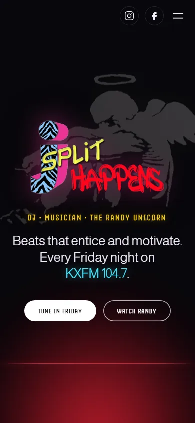
The site of Randy Jay Grad: DJ, classically trained musician and resident of the Fifty Fathoms radio show on KXFM 104.7, Laguna Beach and LA. The one wish was to keep the 80s and disco look, so we did not drop it but rebuilt it: neon, Memphis and cassettes now work for an easy site.
- The 80s identity stays. The zebra “SPLiT HAPPENS” logo, the Banksy style angel, the Joker and neon titles, which are now live text, not pictures.
- A retro TV with video. Randy talks from the screen of an old TV among cassettes, a Rubik's cube and Pac-Man, the sound turns on with one button.
- The radio show with a countdown. A blue Fifty Fathoms card and a countdown to the next Friday, 8pm Los Angeles time, with a yellow on air bar at the top.
- Mixes as covers. Six shows with dates and titles, like a shelf of records, and the story of The Randy Unicorn in a bright pink block.
- Contact from a phone. A booking form and Instagram and Facebook buttons, and on a phone everything sits in one column with no sideways scroll.

Scroll the page inside the frame
Kallidora Skin Care, a skin care studio in New York
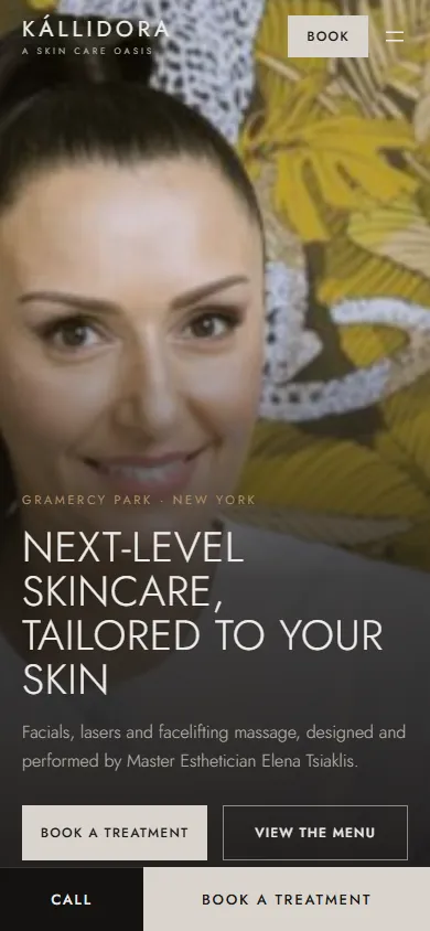
A boutique studio in Gramercy Park, Manhattan: facials, lasers, microneedling and facelifting massage by Master Esthetician Elena Tsiaklis. We rebuilt the site from scratch: now the first screen shows who does the work, and booking takes one tap.
- The owner on the first screen. Elena against the leopard wallpaper of her own studio, next to the Book a treatment and View the menu buttons.
- The whole menu with prices. 22 treatments in five tabs, each row with minutes, price and a Book button that goes straight to Vagaro.
- The look of a high-end studio. A dark warm palette with bronze, thin capital headings and the silver cheetahs from their logo in the footer.
- Real photos. Only their own photo shoot: treatments, Elena, the lounge and the hallway of the studio, not a single stock shot.
- Booking from a phone. Call and Book buttons stay pinned at the bottom of the screen, and the mailing list sign-up sits on a hydrangea photo.

Scroll the page inside the frame
TechClean Industries, HVAC and building cleaning in New York
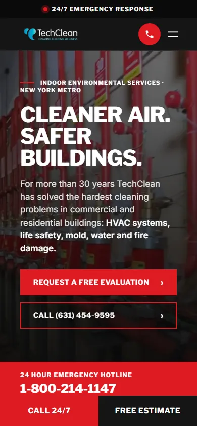
HVAC cleaning, life safety inspections, water, fire and mold remediation in commercial buildings for more than 30 years. We rebuilt the site from scratch: now the first screen shows what they help with and the number to call day or night.
- The emergency line in sight. A video of a fire suppression system at the top and a red 24 hour hotline badge in the corner, so in an emergency people call at once.
- Twenty services, no clutter. Six directions numbered 01 to 06, each one opens its own card with a photo and the list of works.
- Trust in numbers. 30+ years, 24/7, 20+ services and FDNY in big red numbers, and The New York Times story in its own block.
- A free estimate request. The form is right on the homepage next to the phones and the address, and on a phone the call and estimate buttons stay pinned at the bottom.
- Old addresses still work. Every page kept its address, so links from Google did not break.
Scroll the page inside the frame
Asbury Auto Spa, car wash in Asbury Park, New Jersey
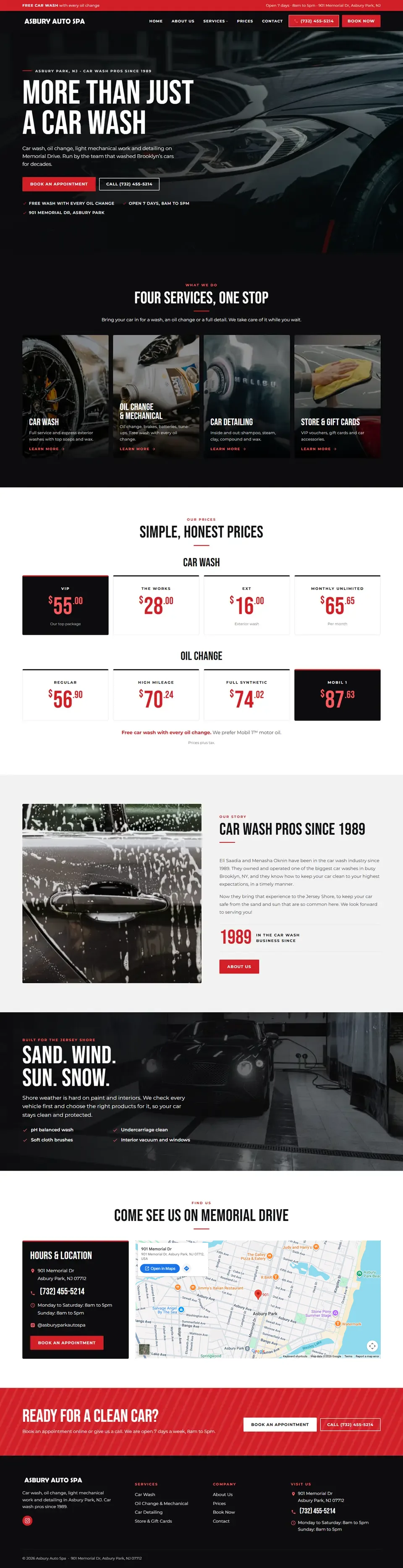
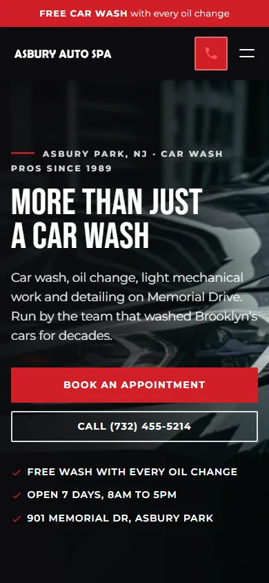
Car wash, oil change, light repairs and detailing on the Jersey Shore, run by owners in the business since 1989. We rebuilt the site from scratch: now the first screen shows what they do, what it costs and how to book.
- Prices in big numbers. Wash and oil change packages on their own cards, from EXT to Mobil 1, with the top package in black.
- Four services as tiles. Car wash, oil and repairs, detailing, gift cards: every tile has a photo and opens its own page.
- Booking from any screen. A Book Now button and the phone number in the header, and on a phone the call is one tap.
- Brand colours. Black and red from their logo, the red diagonal stripes of the old banner and a tall, narrow heading font.
- Old addresses still work. Every page kept its address, so links from Google did not break.

Scroll the page inside the frame
Sahar Miami, rental condos in Miami Beach
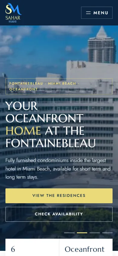
Six furnished condos inside the oceanfront Fontainebleau hotel, for short and long term stays. We rebuilt the site from scratch: now a guest sees the ocean on the first screen, picks a condo and asks about free dates right away.
- The ocean on the first screen. Shots of the Fontainebleau, the beach and a balcony view change on top, next to two buttons: to the condos and to the booking form.
- Six condos side by side. Every card has a photo, the floor and the view: pool, ocean, bay or city. They can be compared without opening a single page.
- Real views from the balconies. A separate block of photos taken from the condos' own balconies, each captioned with its unit.
- An inquiry with dates. The form has a check-in and check-out calendar with Weekend, 1 week and 1 month buttons and a choice of condo. Every inquiry is saved in the site admin, even if the email gets lost.
- Short or long. Separate blocks for holidays and for long term stays, each with its own button.

Scroll the page inside the frame
Sew Grace, handmade gifts
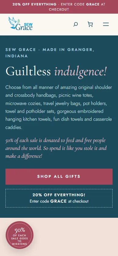
Ethel sews kitchen towels, pot holders, wine totes and handbags herself, and every print is one of a kind. We rebuilt her WooCommerce shop as a gift shop where everything is on the first page.
- Colours from the logo. Teal from the word Grace, the olive branch and rose buttons, while serif type and a handwritten signature suit things sewn by hand.
- Everything on one page. All 123 gifts in stock right on the home page, in groups with a filter, so nothing has to be hunted for.
- Her own words. Ethel's own texts on top and the 20% GRACE coupon, visible on every page.
- The maker's story. A block about Ethel with her signature and the fact that half of every sale goes to missions.
Scroll the page inside the frame
Sparta Jobs, recruitment agency in Kraków
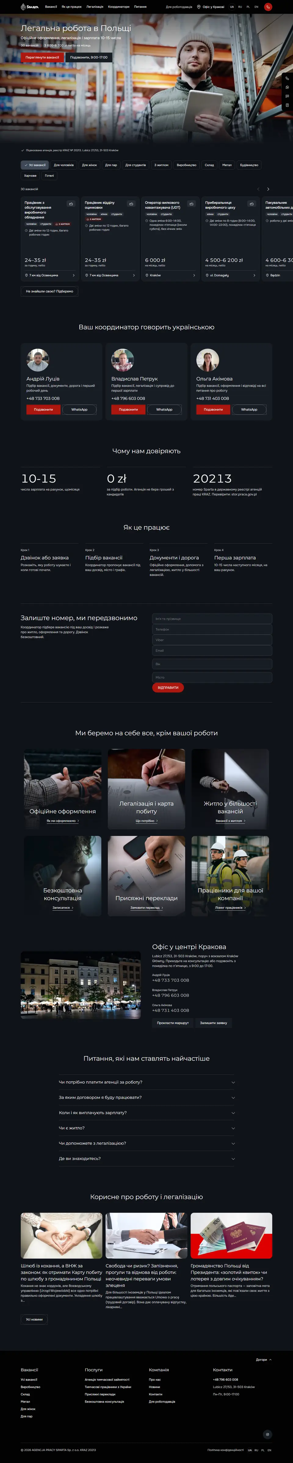
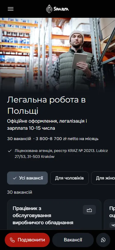
The agency finds jobs in Poland for Ukrainians and other foreigners and supplies workers to Polish companies. We rebuilt the old site from scratch: one path for people looking for work, another for employers, and a job can be found and a call made straight from a phone.
- Two sites in one. The site for candidates speaks Ukrainian and Russian, the one for companies Polish and English, each with its own menu, forms and phone number. Visitors land on the version in their own language.
- Jobs with filters. One tap shows work for men, for women, for couples, for students or with housing. Each card has the net rate, the schedule and the city.
- Real people instead of an anonymous form. Three coordinators with a photo, phone and WhatsApp, under the heading “Your coordinator speaks Ukrainian”.
- A call from any screen. On a phone a bar with Call, Jobs and WhatsApp is always at the bottom, and outside office hours it offers an application instead of a call.
- Trust built on facts. The number in the state KRAZ register of agencies with a hint on where to check it, recruitment for 0 zł and pay on the 10th to 15th of the month to a bank account.

Scroll the page inside the frame
Hair Allure, beauty salon in Kraków
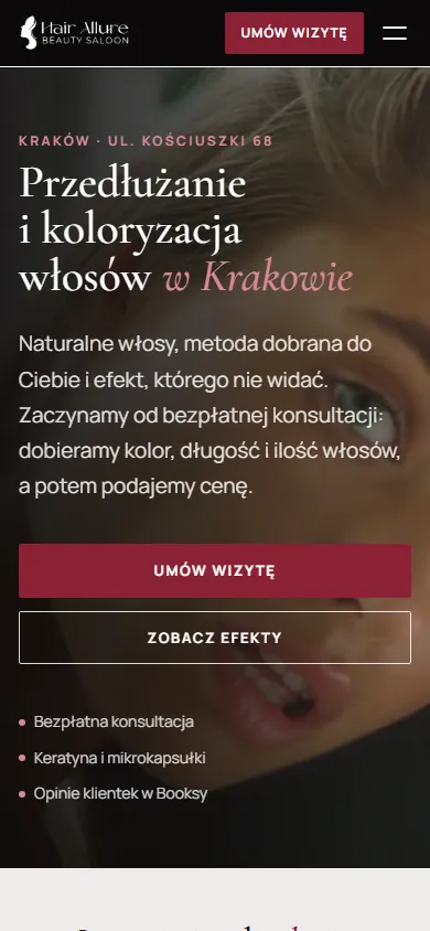
The salon does two things: hair extensions and colouring. The site had to show real results, answer questions before booking and let people book in one tap, on a computer or a phone.
- Video on the first screen. Hair in motion close up, a headline with the city and the service, and a booking button under it. In a second you know where you are.
- Booking in the header. The “Umów wizytę” button goes straight to Booksy and stays in view on every screen, with the salon's phone next to it.
- Real work instead of stock photos. The gallery is made of the salon's own client photos: length, colour, capsules close up, the procedure and the team.
- Answers before booking. A comparison of methods, the steps of a visit and questions before the first booking. Clients come to the consultation prepared.
Scroll the page inside the frame
Mere Black Coffee, whole bean coffee
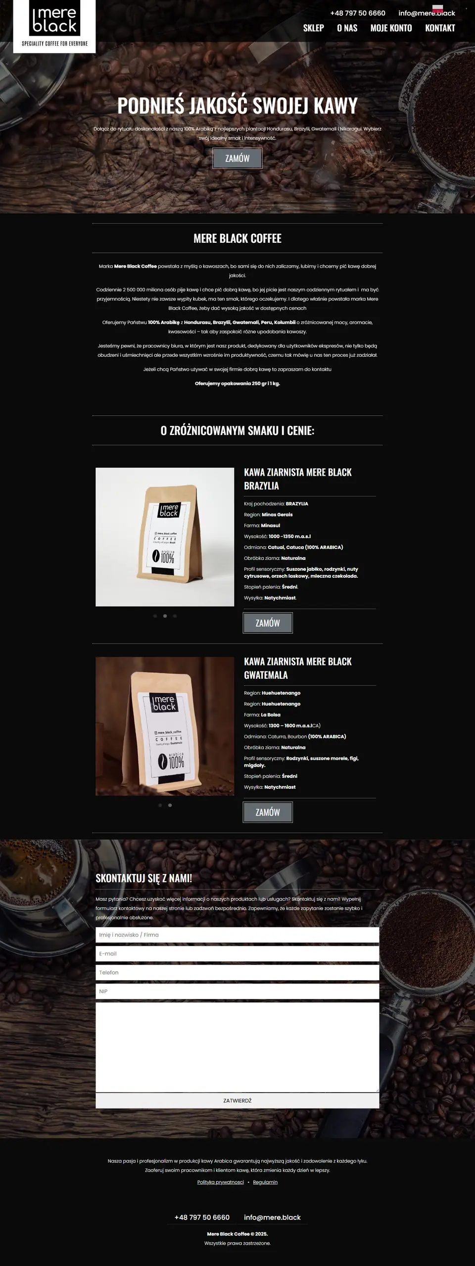
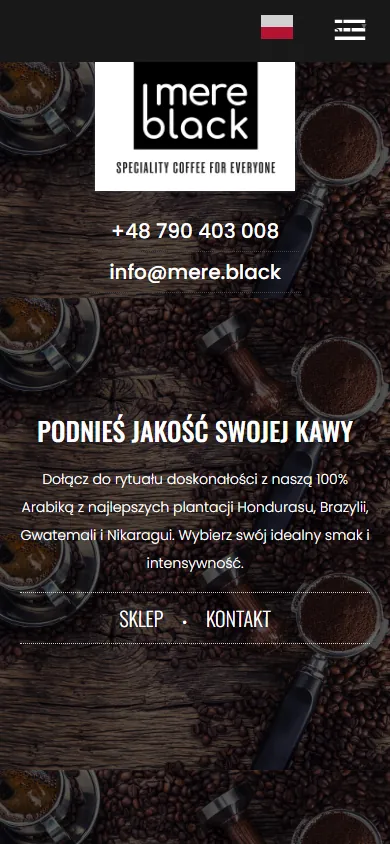
A Polish brand of 100% Arabica for coffee lovers and offices. The landing page had to convey the taste through a screen and let people order a bag without looking for a shop.
- Atmosphere from the first screen. Coffee beans on dark wood, the call “Podnieś jakość swojej kawy” (raise the quality of your coffee) and an order button right below it.
- Every coffee has a passport. Country, region, farm, altitude, variety, process, tasting notes and roast level. For a coffee lover these are arguments, not just a name on a bag.
- Ordering in one tap. A “Zamów” (order) button sits next to every coffee and leads to a WooCommerce shop with online payment.
- A separate path for companies. A block about coffee for the office and a contact form: a company can arrange regular deliveries instead of buying one bag at a time.

Scroll the page inside the frame
Gallery 36, painting gallery in Kraków
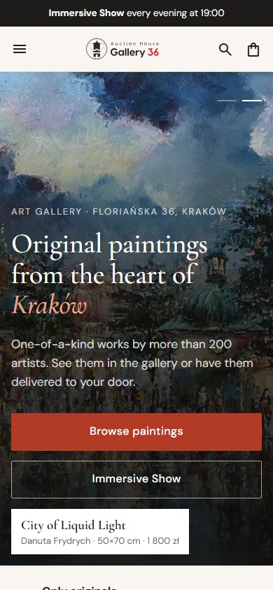
The gallery at Floriańska 36 sells original paintings by more than 200 artists and runs an Immersive Show every evening. The site had to be a shop window where people can choose a painting, try it on their own wall and buy it without leaving home.
- A first screen like a gallery room. Paintings from the collection change in the background, and a label shows the title, artist, size and price. One button leads to the catalogue, the other to the show.
- Entry by budget and by subject. Tiles from “under 500 zł” to “over 2 000 zł” and sections by subject: Kraków, nature, animals, people. Visitors go straight to where their painting is.
- The painting on your wall. The painting page has three tabs: the painting, in a frame and on a wall to scale. Next to it, a frame designer, the gallery in 3D and a 3D animation.
- A show people buy tickets for. A dark block with photos of the Immersive Show: time, length, number of seats and a button to buy a ticket.
- A shop without extra steps. Cart, checkout, favourites and a customer account on WooCommerce, the whole site in two languages.
Scroll the page inside the frame
S.E. TRADE, fibres for concrete
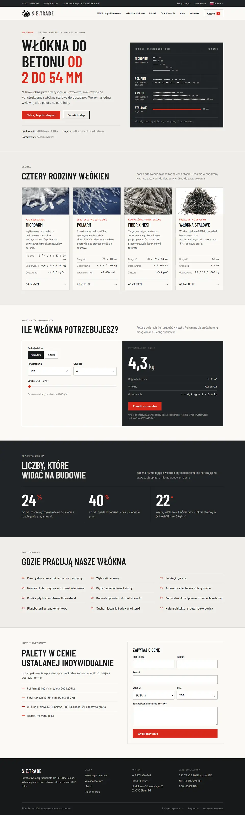
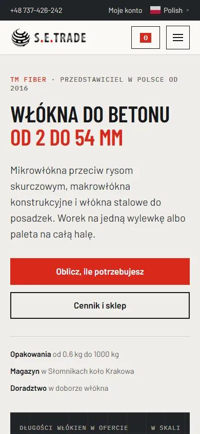
The TM FIBER representative in Poland sells micro, macro and steel fibres for concrete, from a bag for one floor to a pallet for a whole hall. The buyers are builders, and they choose by specs, not by pictures.
- Fibre lengths to scale. The first screen has a ruler: every fibre family is drawn at its real length, from 2 to 54 mm. A click on a family leads straight to its price list.
- A shop that works like a price list. Instead of identical product cards, a table by family: length, pack, stock, price and an add to cart button in one row.
- A dosage calculator. Enter the area and thickness of the screed, and the site works out the kilograms of fibre and the number of packs.
- A separate path for wholesale. Pallets without a listed price got a “Zapytaj o cenę” (ask for a price) button and a form for quantity, use and delivery place.
How we build a website
- We work out who your client is. What worries them, what they fear and what they need to see to write to you. The structure of the page grows from that.
- We write the copy. Each block answers one question of the client and leads to the next. No filler and no generic words found on every other page online.
- We design for the niche. A beauty salon, an advisor and a coffee brand look different, because their clients choose differently.
- We check it on a phone. Most visitors come from a smartphone, so we check every screen on a narrow screen, not just on a computer.
- We launch and hand over. Domain, hosting, request forms, email. You get a finished website and all the access to it.
Need a website or a landing page?
Tell us what you sell and to whom. We will suggest a structure and tell you what it will cost.